
Today the Blackhawks received their 2013 championship rings, just 2 days before opening night. Honestly, all I can really say is wow. These things are amazing.


To compare the two rings, here is the face of their 2010 Stanley Cup ring:
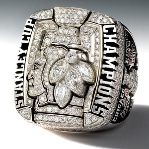
Personally, I like this year’s ring a bit better. Not that there’s anything wrong with the 2010 ring, it’s just that I like the red rubies on this year’s ring. It’s also pretty cool how they inscribed each opponent and the outcome of each series from the playoffs on the inside of the finger hole. These will be tough to beat.
