Ranking the NHL team logos

Recently The Hockey News magazine came out with their NHL logo rankings, which I thought was pretty interesting and fun to look at. So, I decided I’d do my own rankings. Like The Hockey News did with theirs, I am simply looking at the logo of each team and not taking any history or anything else into account. We’re just looking at the logos here. With that, let’s get to it.

306cphie5heyvfwn6lbzfowe61h

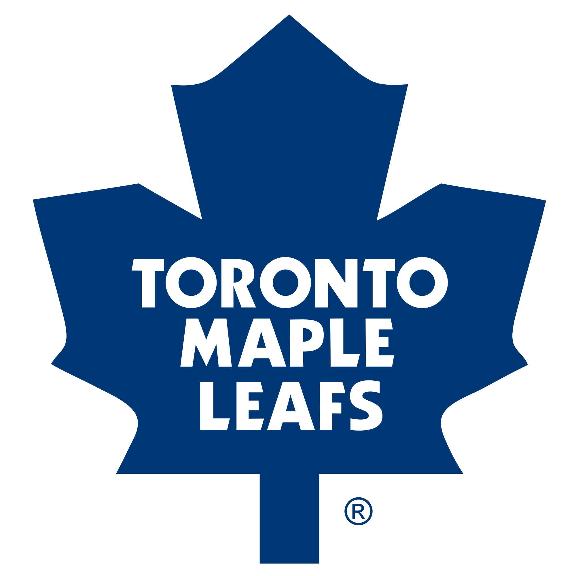
There’s just not a whole lot that’s interesting or unique about this logo. It’s simply just a blue maple leaf with letters on it.

29. TampaBayLightning_LOGO

For being recently modified, you’d think the Lightning would have come up with a more creative design. This is one of the more boring logos in pro sports.

28. ANAHEIM_DUCKS_LOGO

I absolutely hated the logo the Ducks had been using for the past 8 years or so, but this new one isn’t much better. 

27. 940-couture-logan

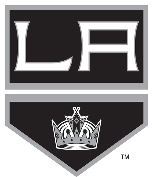
The Kings’ logo looks like some kid decided one day to come up with a logo on Photoshop. Their old logo was way more interesting to look at.

26. 174

Here’s another example of a boring logo. Maybe if Pittsburgh went back to their color scheme from the early ’90s it would look a bit better.

25. WinnipegJets

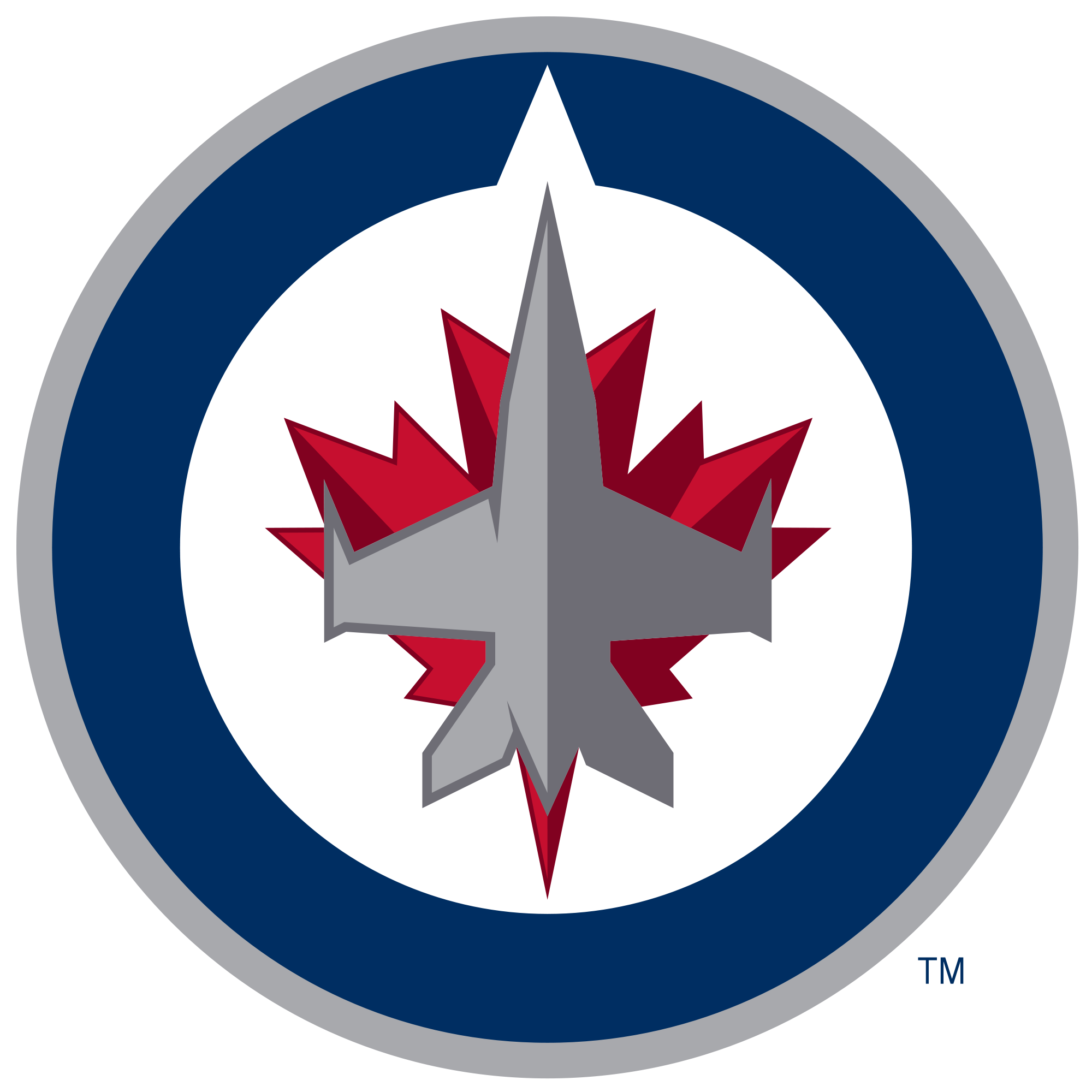
I think the Jets were on the right track with this logo, but there’s too much “blah” to it. I feel like it needs words with it or something.

24. 6cphie5heyvfwn6lbzfowe61h

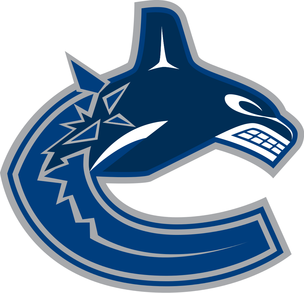
Does anyone really know what this is supposed to be? It looks like a whale/shark and then I have no clue what the rest is.

23. 6cphie5heyvfwn6lbzfowe61h

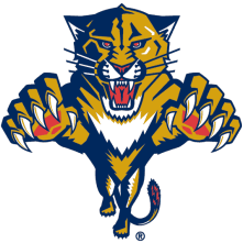
There must be 5,000 high schools in America with this same logo. At least the Panthers used some bright colors to go with it.

22. NHL-Nashville-Predators-Logo-Wallpaper

Definitely a unique logo that the Predators have. The new color scheme makes it look better than it used to.

21. st-louis-blues-logo

This isn’t necessarily a bad logo, but it’s not very interesting or intimidating either. 

20. 7327531

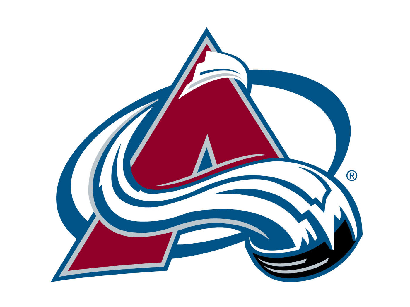
Here’s a logo that hasn’t changed at all. I like how it’s supposed to be a hockey puck creating the “avalanche.”

19. 6cphie5heyvfwn6lbzfowe61h

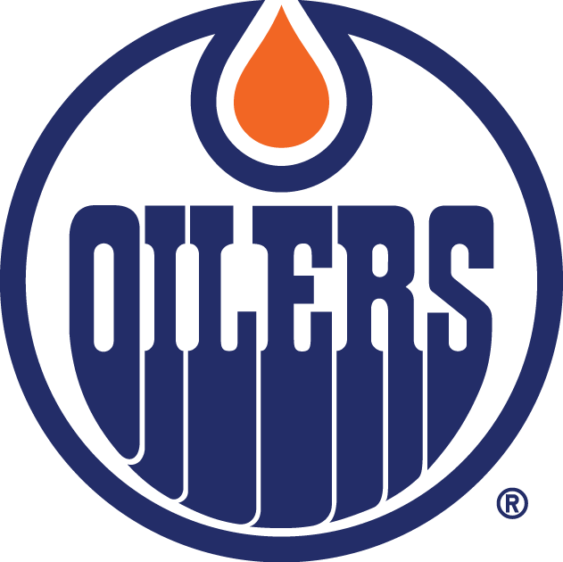
This logo hasn’t really changed over the years either. The oil-drip at the top and the oil “dripping” off the bottom of the letters are what makes this logo. Good colors too.
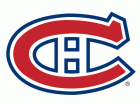
18. si34dm1f9jex9eoexq9l1svqk

The only reason this logo isn’t lower is because of the “H” in the middle of the “C.” It stands for “Habs,” which is the Canadiens’ nickname in Montreal.

17. 161

I’m not entirely sure what this logo is or what a “Flyer” is, but it looks pretty cool. Also, orange and black is always a great color scheme in sports.

16. 144

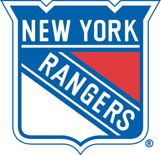
I like how the Rangers use a shield for their logo, and I like the diagonal lettering. Royal blue is a color not used often enough in sports, and the red that the Rangers use is unlike any other red in the NHL.

15. 161

The Capitals are one of just a couple teams to use words for their logo, which makes this unique. Navy blue and red are always good together.

14. crestonwht_rgb

Good colors and an intimidating logo. The broken stick in the shark’s mouth is a good touch.

13. 6cphie5heyvfwn6lbzfowe61h

This is a very detailed logo compared to most others. To me though, it seems more like a secondary logo.

12. 6cphie5heyvfwn6lbzfowe61h

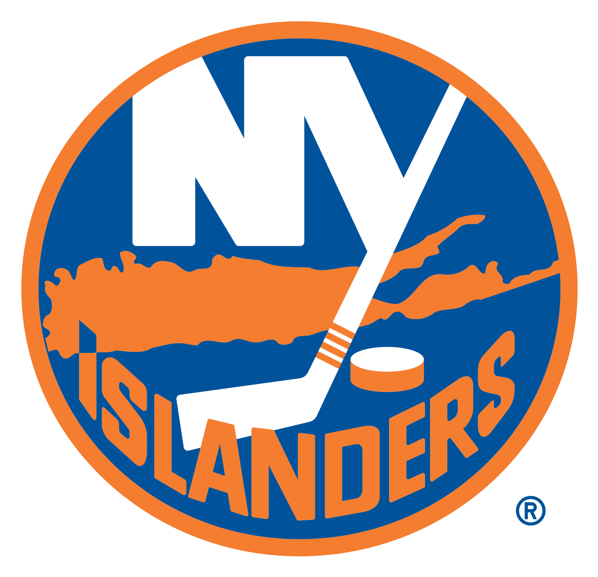
Most people will glance at this logo and think that the creators of it just splattered some orange paint in the middle of it, when in reality it’s an outline of Long Island. Pretty creative.

11. jesus-clip-art-2

Here’s a simple, but good logo. The flames coming off the back of the “C” get the point across as to what the team name is, and the bright red and yellow look good as well.

10. Minnesota-Wild-Wallpaper-

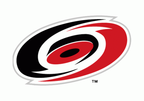
Clearly this is a hurricane, but it’s a cool looking hurricane. The colors make this logo pop out and look more intimidating.

9. ANAHEIM_DUCKS_LOGO

The guys over at The Hockey News had this ranked second on their list, which was surprising. It’s a good logo, but I’d like to see brighter colors.

8. New_Dallas_Stars

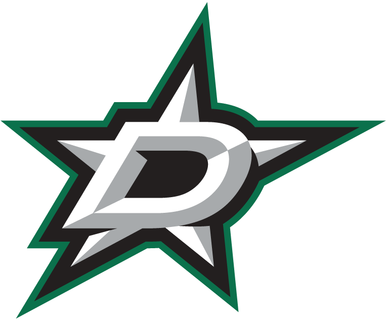
I’m somewhat second guessing myself for putting the Stars’ logo so high because of the fact that it looks like an AHL team’s logo. I preferred Dallas’ previous logo and colors, but this one isn’t bad. Still good colors.

7. DRW Logo

The winged-wheel is one of the more recognizable logos in sports. Pretty basic colors, but a very detailed logo for being so old.

6. Minnesota-Wild-Wallpaper-

It took me a while to figure out what this was when the Wild first displayed it. Once I understood it, the more I liked it. The trees and river in front of the red sunset and shooting star is a perfect logo for a Minnesota team.

5. 6cphie5heyvfwn6lbzfowe61h

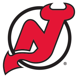
This is another logo that some people have to think about for a second. The red is an “N” combined with a “J.” Pretty basic, but I like it.

4. Boston_Bruins_logo

I’ve always like the Bruins’ logo simply because it looks cool and I love the colors.

3. NHL-Nashville-Predators-Logo-Wallpaper

I was extremely happy when the Sabres brought back their original logo a couple years ago. The two swords are what makes this logo as good as it is, not to mention the great colors.

2. bluejackets07-rgbjpg-8678ad1b3fbe2735

The star with the Ohio state flag wrapped around it is a great look and tribute to the state itself. Add in the navy blue and red, and this logo is tough to beat.

1. 56

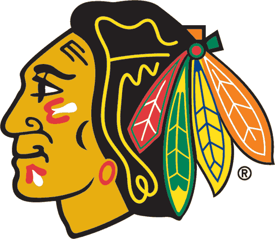
Often regarded as the best logo in sports, it’s hard to disagree. The Blackhawks’ logo is full of color and pays tribute to Chief Black Hawk, as well as the 86th infantry division of the U.S. Army in World War One. You never hear of this logo being talked about as “disrespectful” to the Native American community, and that’s because of the significance behind it and it’s respectful appearance. 

I think it’s safe to say that the NHL might have the best group of logos in all four of the major pro sports here in the U.S. Ranking them is not easy and is definitely debatable.

Advertisement

MLB stadiums I have not visited

I have now been to 22 different MLB stadiums (20 still active), and I often think about which ones I would put at the top of my “to-do” list that I have not yet been to. Obviously, I’d go to any MLB stadium on any given day if I had the chance, but there are those that I’d rather visit than certain others. So, I put together my list of the 10 remaining stadiums that I have not been to, and ranked them from worst (I’d least like to visit) to best (I’d most like to visit).

10. OAKLAND COLISEUM: A’S

139990-330-0

It’s old, hasn’t really been touched up, and also plays host to NFL games. Enough said.

9. TROPICANA FIELD: RAYS

7327531

I hate indoor stadiums, I hate artificial turf, and I highly dislike the fact that Tampa Bay even has a team, considering their fans don’t exist.

8. TURNER FIELD: BRAVES

139990-330-0

First of all, I’ve heard multiple times that this park is located in a bad area of town. Second of all, there doesn’t appear to be a whole lot of uniqueness to Turner other than the fact it hosted the Olympics. To put the whipped cream on top, Atlanta fans are some of the worst in sports.

7. MARLINS PARK: MARLINS

139990-330-0

For being such a new stadium, one would think it would be more attractive than it is. However, I’m sure there is some cool, modern stuff to it. Too bad this thing was built for a team that has zero fan support.

6. COMERICA PARK: TIGERS

139990-330-0

Honestly, I’ve heard a lot of good things about Comerica. I just don’t exactly have the burning desire to go to Detroit.

5. GLOBE LIFE PARK IN ARLINGTON: RANGERS

139990-330-0

(They need to quit re-naming this place) The park looks really interesting, and I love the way the exterior of the park looks in pictures. This is a stadium I would really like to see.

4. KAUFFMAN STADIUM: ROYALS

139990-330-0

After being renovated in 2009, Kauffman Stadium appears to be one of the more attractive parks in baseball. It has many unique features and would make a good road trip.

3. CITIZENS BANK PARK: PHILLIES

139990-330-0

Built in 2004, this is a relatively new stadium and it seems to be quite an attractive one as well. I’m sure there are many good vantage points to watch the game around this park.

2. CITI FIELD: METS

139990-330-0

Again, one of baseball’s newer parks, which instantly makes it intriguing. Add in the fact that it’s in New York City, and there’s really no reason to not want to go here.

1. SAFECO FIELD: MARINERS

139990-330-0

I’ve heard nothing but great things about this park and the city of Seattle. Can’t say that about the rest of the stadiums on this list. If only the Mariners drew a bit better…

So there it is. Hopefully I’ll be writing my reviews about these parks before too long.

Eastern Conference Final prediction

So, how many people predicted THIS matchup for the ECF? I don’t think many people saw an Eastern Conference Final series that did not include either Boston and/or Pittsburgh. I did predict prior to the second round that the Rangers would upset the Penguins, and I also said the Bruins would eliminate the Canadiens in seven games, but that I had very little confidence in picking Boston. So I almost got it right….almost.

Let’s get to it.

si34dm1f9jex9eoexq9l1svqk vs. 144

An “all Original Six” series is never a bad thing, and I don’t anticipate this one to be any different. The Rangers come into this series with a ton of confidence and momentum after storming back from a 3-1 series deficit to knock out Crosby and Malkin (I must admit that I was quite happy with that outcome). Henrik Lundqvist has continued to do what he does best, and that is keep the puck out of his net as well as anyone in the game. He ranks second this postseason in GAA and Save %. Only Corey Crawford has better numbers in those categories. Offensively, the Rangers are by far the worst team at scoring goals of any of the four teams remaining in the playoffs. They are averaging just 2.43 goals per game. While Rick Nash is still searching for his first goal of the playoffs, that’s not to say the rest of the Ranger forwards have been much better. The highest point total this postseason of any Ranger is 9 by Brad Richards. To compare, the Kings have four players with at least 11. New York absolutely has to step it up offensively if they want to advance, especially considering the fact that they’ll be going up against Carey Price. However, to neutralize their weak offense, the Rangers have the lowest GAA average in these playoffs. The phrase goes something like “defense wins championships,” so hopefully for New York’s sake that phrase will prove to be true. I think the keys for New York in this series will be slowing down PK Subban, who leads Montreal in points, and getting production from their third and fourth lines.

Montreal also comes into this series riding a huge wave of momentum after eliminating the President’s Trophy-winning Bruins in seven games. A surprising number of people actually picked the Canadiens to win that series, and sure enough here we are. How did the Habs do it? Well, they got some great goaltending from Carey Price throughout those seven games, their forechecking was relentless, their determination was through the roof, and they simply played with confidence. Those four things combine to make a great recipe for success (maybe something the Penguins might want to try in the future). PK Subban took his game to a totally new level against Boston and was undoubtedly Montreal’s MVP of that series. I doubt he’ll be able to play that same way this entire series against New York, so guys like Markov and Emelin are going to have to pick up their games even more. In goal, Carey Price has been stellar with 2.15 GAA and a .926 save %. Want an interesting and telling stat? Over the last six games that Price has started against New York, he has recorded FIVE shutouts and allowed just one goal total. Take a second to try and comprehend that… On offense, the Canadiens lead the playoffs by averaging 3.27 goals per game. Similar to the Rangers, their leading scorer, Subban, has 12 points in the playoffs, but he is the only guy in double digits. The next closest point total to Subban is 9, shared by Eller and Gallagher. The Canadiens cannot rely on PK Subban to carry their offense anymore. They need their top forwards (Vanek, Pacioretty) to take the lead on the offensive side. If they can get more offense from their top lines, as well as their bottom two lines, they’ll be in good shape. The key is just finding a way to get pucks past Lundqvist.

I think this should be a great series. A lot of people think that the passing of Martin St. Louis’ mother helped propel the Rangers to their comeback over Pittsburgh. Whether or not that is true, they are playing great hockey right now, but so is Montreal. It takes a hell of an effort to beat the President’s Trophy winner in a seven-game series, but the Habs did it. Both teams have incredible home-ice advantages, so winning on the road in this series will be huge. Much like the matchups in the second round, the outcome of this one is tough to determine.

-Montreal wins series, 4-2.

I’ll be back with my Blackhawks-Kings prediction sometime before the first puck-drop of that series.

NFL Stadiums I Would Most Like To Visit

These are the top 10 NFL stadiums that I most want to visit. I going based off of the atmosphere at each stadium, and the history behind each stadium.

10. Gillette Stadium – Patriots

It would be really fun to see a game here during a snow storm like they’ve had in the past.

9. Metlife Stadium – Giants/Jets

It’s the newest, and arguably the nicest stadium in the league.

8. Louisiana Superdome – Saints

Without a doubt one of the loudest stadiums in the league.

7. M&T Bank Stadium – Ravens

This place is frequently described as being one of the best home-field advantages in the NFL.

6. Qwest Field – Seahawks

The fans here are known as the “12th Man” because of the noise that they produce when the Seahawks’ defense takes the field.

5. Arrowhead Stadium – Chiefs

Again, this place is a strong candidate for being the loudest stadium in the NFL. Also, the name “Arrowhead” just sounds intimidating.

4. Invesco Field – Broncos

This stadium has been known to shake when the fans start “stomping” their feet to mimic a stampede. With the Rocky Mountains just off in the distance, the atmosphere and setting of Invesco Field are tough to beat.

3. Heinz Field – Steelers

Just about every game here seems like a playoff game. When the Terrible Towel gets going, look out.

2. Cowboy Stadium – Cowboys

It’s the largest and most high-tech stadium in the league. Who wouldn’t want to see a game here?

1. Lambeau Field – Packers

No other stadium in the NFL speaks history like Lambeau Field. The “Frozen Tundra” is the cathedral of all NFL stadiums, and has to be the best home-field advantage in the league.

Top 10 NHL Jerseys

Here’s a list of my top 10 current NHL jerseys. I hope you enjoy.

10. Montreal Canadiens

Like most Original 6 teams, this jersey hasn’t changed much over the years.

9. Edmonton Oilers

After years of trying to make the navy blue and copper colors work, Edmonton finally went back to their originals.

8. Vancouver Canucks

They’ve had some of the worst jerseys in NHL history, but this one works. The blue and green fit perfectly together.

7. Detroit Red Wings

These jerseys have barely changed over time. True classics.

6. Buffalo Sabres

I love the navy blue and yellow together. They also finally brought back their original logo last year.

5. New York Rangers

The navy blue jersey above is actually their alternate jersey, and I love it. The diagonal lettering has appeared on the Rangers’ jerseys ever since day one of their existence, except for a couple of years when they tried switching it up.

4. Los Angeles Kings

The black ones had actually served as the Kings’ alternate home jerseys for the past few years until this year. I really like the black, white, and silver.

3. Toronto Maple Leafs

I love the colors, and I love the Maple Leaf logo. The white jersey is their alternate jersey this year, but I thought I’d put it up here to show you the two different logos.

2. Boston Bruins

Easily one of my favorite jerseys in sports. I love the classic logo, and I love the colors.

1. Chicago Blackhawks

Often referred to as the best jersey in sports (their red one), and the best logo in sports. I’d have to agree.

As you may have noticed, all of the Original 6 teams made my top ten. Their jerseys are all classics and have not changed too much throughout the years. Please give your own opinions!